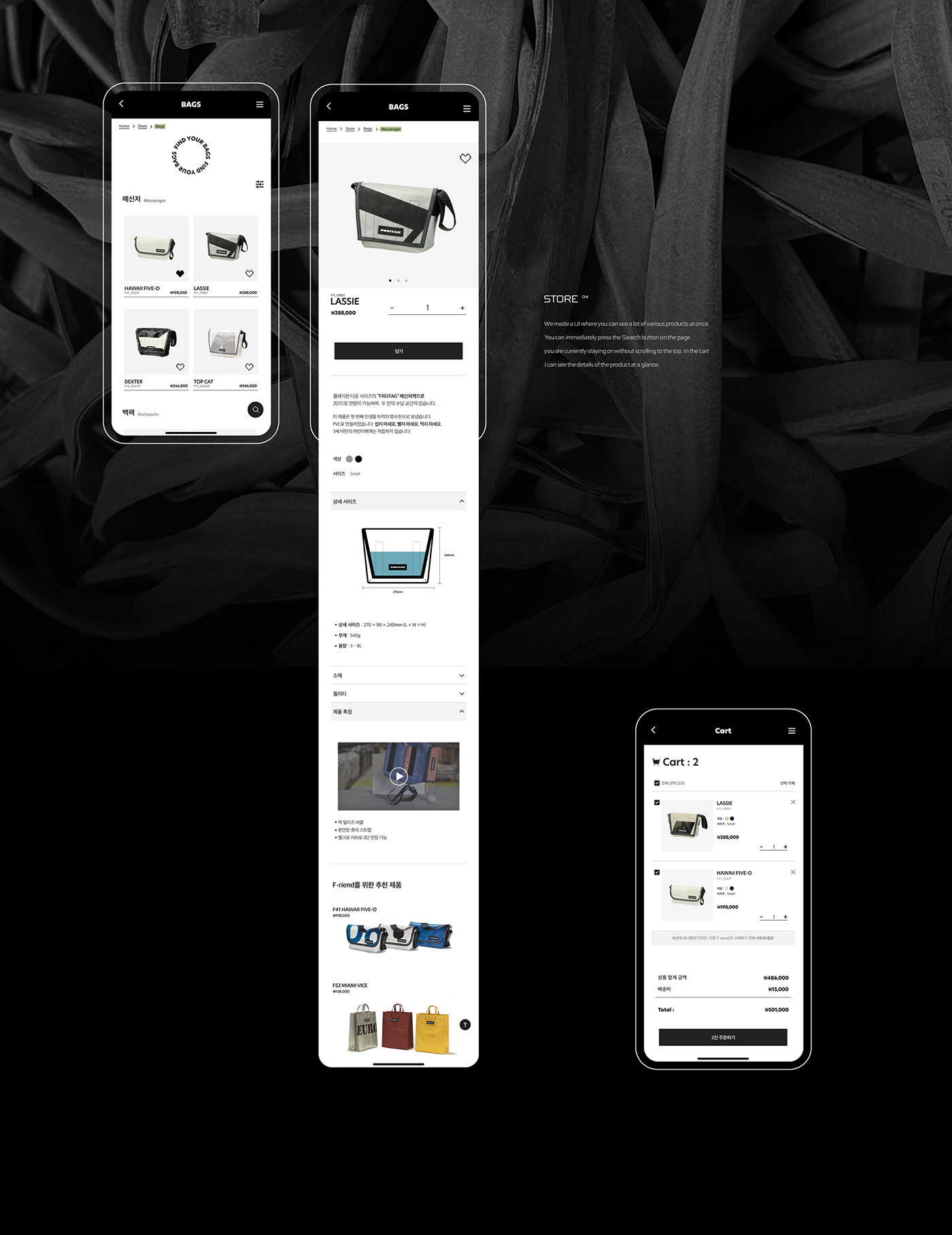
About
FREITAG is a Swiss brand that represents the upcycling field. We are communicating with consumers by pursuing the value of "CYCLE" by making bags with materials that will be discarded if not used and washing them using rainwater. In this project, we designed it by reflecting the humor and minimalism unique to FREITAG. In addition, we used the representative color of the brand, Black & White,
to make it familiar to users when producing it.
프라이탁은 업사이클링 분야를 대표하는 스위스 브랜드입니다.
쓰지 않으면 버려질 재료들로 가방을 만들고, 빗물을 이용해 세탁하는 등 'CYCLE'의 가치를 추구하며 소비자들과 소통하고 있습니다.
이번 프로젝트에서는 프라이탁 특유의 유머러스함과 미니멀함을 반영하여 디자인 하였습니다. 또한 제작시 사용자들에게 친숙하게
다가갈 수 있도록 브랜드의 대표 색상인 Black & white 컬러를 이용하여 작업하였습니다.


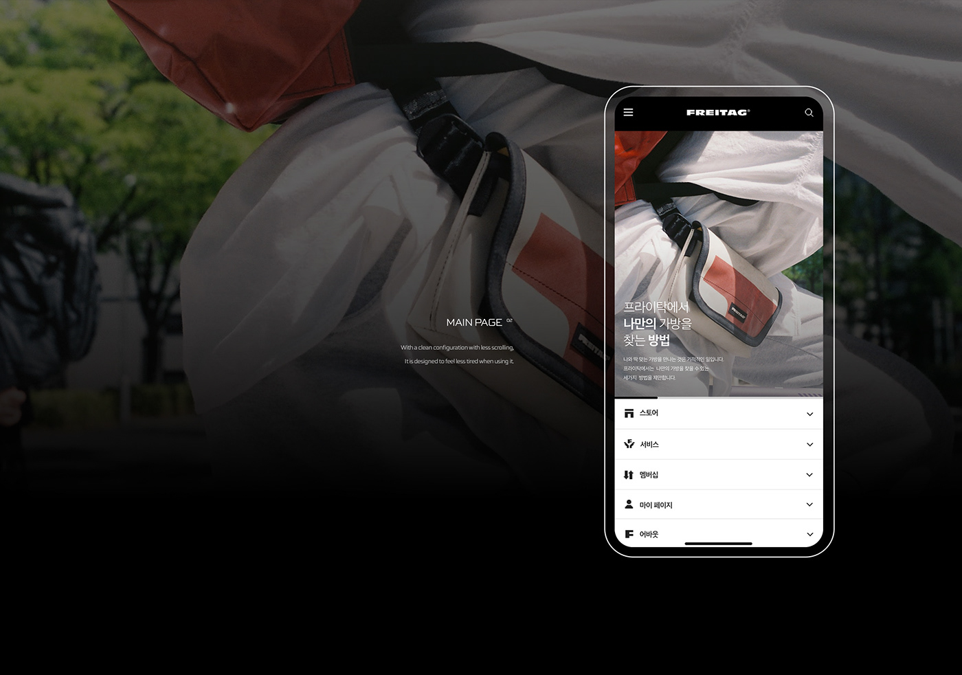
Overview
Domestic FREITAG does not have an application released. For modern people who recognize and use smartphones as a necessity,
the responsive mobile version optimized for computers is considered inconvenient to use, so we planned to create an app.
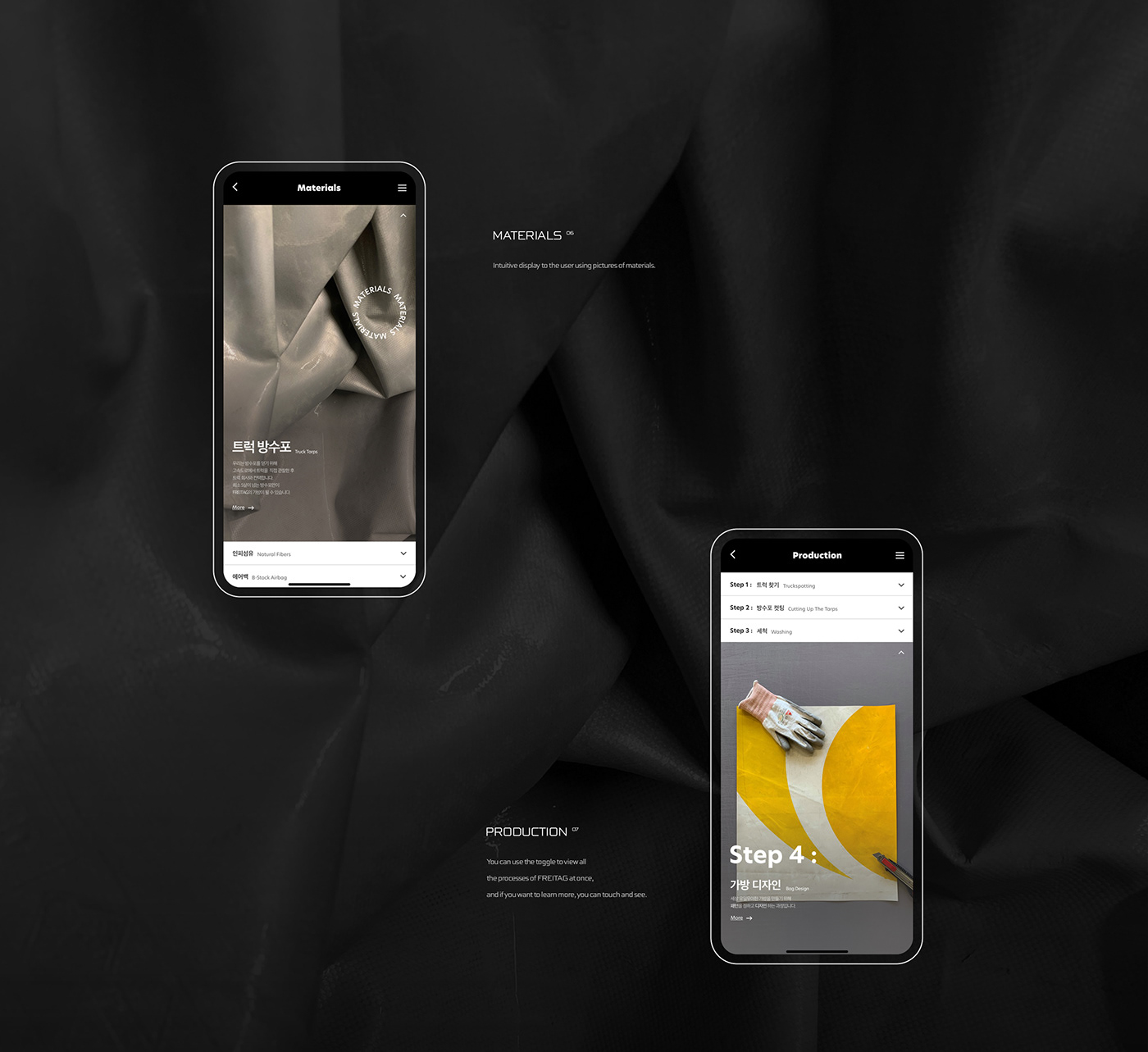
While maintaining the feeling of FREITAG, it improved the inconvenience of the existing mobile version UI, and added an illustration
icon to add intuition. Furthermore, we added a virtual category called TRADE-IN.
국내 FREITAG은 어플이 출시되어 있지 않습니다. 스마트폰을 필수품으로 인식하고 사용하는 현대인들에게,
컴퓨터에 최적화 되어있는 반응형 모바일 버전은 이용에 있어 불편함이 있다고 생각하여 앱 제작을 기획하게 되었습니다.
FREITAG의 느낌을 살리되 기존 모바일 버전 UI의 불편함을 개선하였으며, 일러스트 아이콘을 추가하여 직관성을 더했습니다.